Typographic Design 1985–2015
01/26/2015
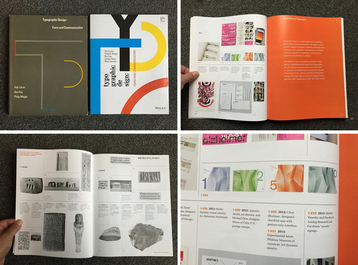
Thirty years ago, I was in my final year of graduate school. The more I learned, the more I discovered I knew hardly anything. I was a newcomer to the field. I went to bookstores looking for supplementary help. One of the first books I found and bought was “Typographic Design” By Rob Carter, Ben Day, and Phil Meggs. The book began with a timeline chronicling the evolution of typography from cuneiform to the first digital fonts of 1980. I had no idea what most of the entries were, or why they were included, but I sure liked looking at them, even in black-and-white.
I still have that book. And now, the 6th edition of the book has been published, revised with the help of Sandra Maxa and Mark Saunders. It’s a tremendous book, with many contemporary projects added illuminating such areas as type and grids, type and film, online typography, and many others. Of course, the book still begins with the typographic timeline. There on the last page of the updated version, sandwiched between such designers as Rick Valicenti and Martin Venezky, and Experimental Jetset and Studio Dumbar, are the Waves of Color Stamps I art directed, designed by my former student, employee, and now colleague and friend Michael Dyer. It’s humbling, and at the same time I’m very proud
Who knows where you may find yourself in 30 years?—Antonio


